UI Components
DatePicker
UI component for selecting a date.
<DatePicker> is a UI component that lets users select a date from a pre-configured range.
See also: TimePicker.

<DatePicker /><DatePicker /><datePicker date={currentDate}></datePicker><datepicker date={date}></datepicker><script lang="ts">
import { Frame } from '@nativescript/core'
let value = new Date()
function goBack() {
Frame.goBack()
}
</script>
<page>
<actionBar>
<label>DatePicker</label>
</actionBar>
<gridLayout>
<contentView horizontalAlignment="center" verticalAlignment="center">
<stackLayout>
<!-- #region example -->
<datepicker bind:date={value}></datepicker>
<!-- #endregion example -->
<label>{value}</label>
</stackLayout>
</contentView>
</gridLayout>
</page>
<style>
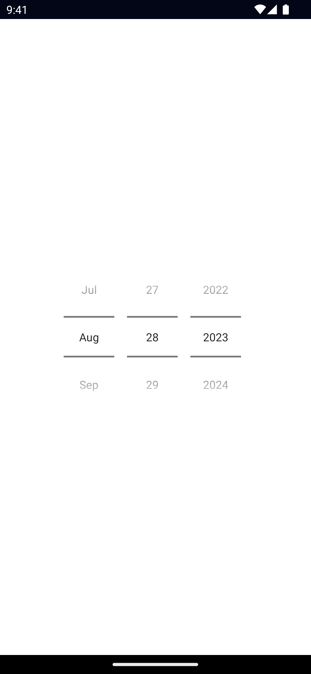
</style><DatePicker /><DatePicker
year="2023"
month="8"
day="28"
date="{{ date }}"
minDate="{{ minDate }}"
maxDate="{{ maxDate }}"
/>Props
date
date: DateGets or sets the complete date.
minDate
minDate: DateGets or sets the earliest possible date to select.
maxDate
maxDate: DateGets or sets the latest possible date to select.
day
day: numberGets or sets the day of the month.
month
month: numberGets or sets the month.
year
year: numberGets or sets the year.
iosPreferredDatePickerStyle
iosPreferredDatePickerStyle: UIDatePickerStyleGets or set the UIDatePickerStyle of the DatePicker in iOS 13.4+.
Default value: 0 (automatic).
Valid values:
0 = automatic: system picks the concrete style based on the current platform and DatePicker mode.1 = wheels: the DatePicker displays as a wheel picker.2 = compact: the DatePicker displays as a label that when tapped displays a calendar-style editor.3 = inline: the DatePickers displays as an inline, editable field
Events
dateChange
on('dateChange', (args: PropertyChangeData) => {
  const picker = args.object as DatePicker
  console.log('New date:', args.value)
})
Emitted when the selected date changes.
See PropertyChangeData.
minDateChange
on('minDateChange', (args: PropertyChangeData) => {
  const picker = args.object as DatePicker
  console.log('New minDate:', args.value)
})
Emitted when the minimum date changes.
See PropertyChangeData.
maxDateChange
on('maxDateChange', (args: PropertyChangeData) => {
  const picker = args.object as DatePicker
  console.log('New maxDate:', args.value)
})
Emitted when the maximum date changes.
See PropertyChangeData.
dayChange
on('dayChange', (args: PropertyChangeData) => {
  const picker = args.object as DatePicker
  console.log('New day:', args.value)
})
Emitted when the day changes.
See PropertyChangeData.
monthChange
on('monthChange', (args: PropertyChangeData) => {
  const picker = args.object as DatePicker
  console.log('New month:', args.value)
})
Emitted when the month changes.
See PropertyChangeData.
yearChange
on('yearChange', (args: PropertyChangeData) => {
  const picker = args.object as DatePicker
  console.log('New year:', args.value)
})
Emitted when the year changes.
See PropertyChangeData.
Native component
- Android:
android.widget.DatePicker - iOS:
UIDatePicker

